Balance and Visual Weight
Balance is an essential piece of every photograph.
 |
| Taken by: Julie Waterhouse |
Even though the subjects in this photograph are in the distance and to the bottom left corner, there is still a stable and consistent balance throughout the composition. The horses are a dull brown, and do not jump out too much against the misty gray background and swampish green grass; but are vibrant enough to be noticed.
 |
| Taken by: Julie Waterhouse |
This image is very unlike its counterpart. The flowers are very vibrant against the darker background, creating an overall distracting visual effect. This, therefore, is an example of a photograph that has a very poor visual balance and unlike the image above, is not very appealing to the viewer.
 |
| Taken by: Calista Gonzales |
This image is balanced because the subjects are not bright enough to be disorientating and the background matches smoothly with the composition of the subjects. The subjects fill the frame instead of being in only one part of the frame.
 |
| Taken by: Calista Gonzales |
This image has a good visual balance. Though the subjects are to the side of the frame, the background is not to bright or distracting and it is clear where the subject is and what they are doing. The composition is smooth throughout the photograph as well.
 |
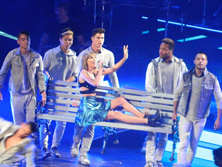
| Taken by: Calista Gonzales |
This photograph is a good example of a visual balance. Even though the composition was taken in a concert setting, the subject is still clear against the dark background, but is not bright enough where it is distracting or hides some of the details.
 |
| Taken by: Calista Gonzales |
This picture has slightly different characteristics as the rest of them. The image is brighter and the composition is lighter. The background is lighter, witch matches with the lightness of the rest of the image. This photograph also displays a well preformed example of a visual balance.
-Calista


